Website Analysis

Overview:
Before a full introspective on the Smith-Gilbert Garden’s website was done issues had already become apparent, namely its size negating any ease of movement and the color scheme providing a difficult read. The ability to locate different pages is minimal, as the sizing of the links or buttons leading to them is far too small, or have obscured placement on the site. There are useful pages that are not prominent such as limited time events such as Art Blooms or Dog Days that are not immediately obvious but would promote better community engagement had they been presented to the user.
These issues combine to present any user of the website with a strain with simply navigating the website to find what in the garden may interest them.
Formatting and Accessibility:
There are multiple cases of colors being used for both the font and background that make reading difficult even as someone with unimpaired vision. The title section on the homepage features their name “Smith Gilbert Gardens” as a flat white outline of letters or green and orange font, over a lower resolution image of the gardens featuring primarily green and orange. It doesn’t provide any contrast and makes for difficult reading and an off-putting introduction to their website. A better image could be used while maintaining their font and color choices or alternatively the font colors could be changed to provide an easier sight.

Aedan Barker. Smith Gilbert Gardens Hero Image [screenshot]. Retrieved from smithgilbertgardens.com.
Other prospective changes include condensing the website’s accessible pages into a better landing page; this is the aspect encountered that’s most difficulty with when navigating the Smith Gilbert Gardens website. Reducing the workload required just navigating from the home page to their Facebook, or their newsletter, both of which are very small buttons at the top or bottom of the page which can be easily missed. The Facebook button does not even work; while Smith-Gilbert has a Facebook page, their link on their main website doesn’t work. Fixing this hyperlink by just accurately linking their live page would be the fix.
Alternatively, with design choices like in the Staff section, the biggest space on the screen is an image of the gardens and not the list of staff itself. When trying to contact any of the staff or the garden’s official email, it should be the easiest thing to find on the page.
The sitemap is inconsistent with the structuring of the website, and lacks accurate names for some sections; namely the ‘Helpful Links’ sections or the ‘Event Calendar’, which is blank.
Accurately providing a Calendar would show potential garden goers a more apt overview of what different experiences can be.
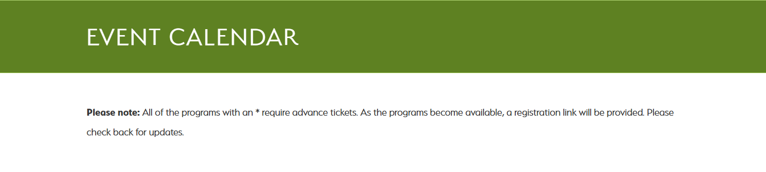
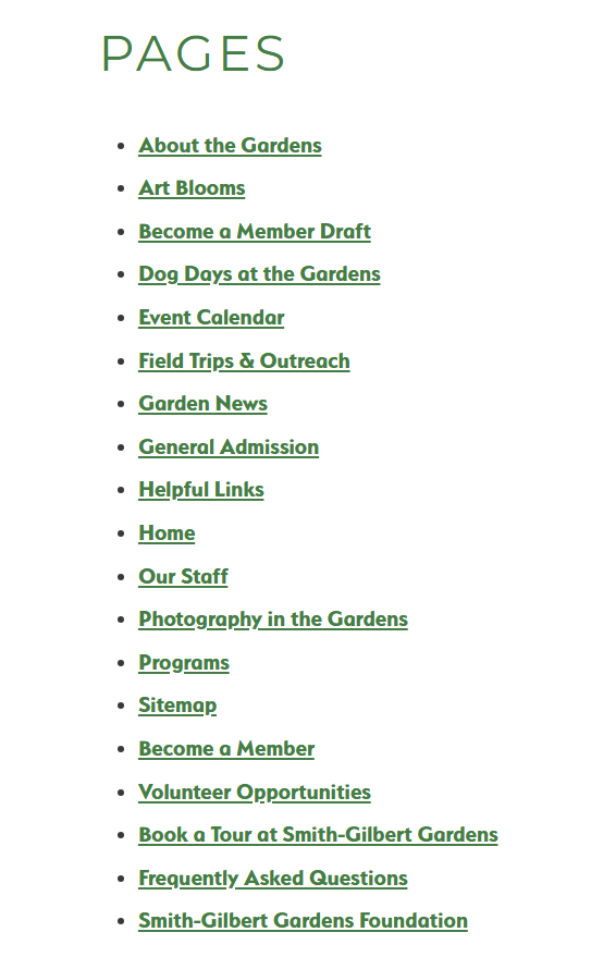
Aedan Barker. Sitemap Inconsistencies [screenshot]. Retrieved from smithgilbertgardens.com.
Hierarchy of Links:
Smith-Gilbert Gardens also have a labyrinth of links for some areas like Art Blooms, where when trying to submit art those interested can ‘learn more’, which leads to a second page which details what Art Bloom submission entail, then prompts finding out how to submit, which leads to a third page where a PDF is found that provides details on submitting. This page isn’t even hosted on the gardens own website and is a visual mess.
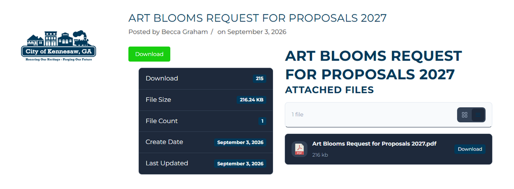
Aedan Barker. Art Blooms Submissions [screenshot]. Retrieved from www.kennesaw-ga.gov.
At minimum one of these steps could be removed and replaced with a longer or more detailed page, as none of them are more than a paragraph or two of information at most.
Tags
There is also a feature on the website where tags are applied to posts or pages, but there is no method for searching by tag, only being given the ability to click on existing tags on pages already visited. Only there can other posts with the same tag be viewed. Adding a simple search by tag would allow for more accessibility for potential searches within the gardens website itself.
Leave a Reply