Social Media Analysis

Where can we grow?
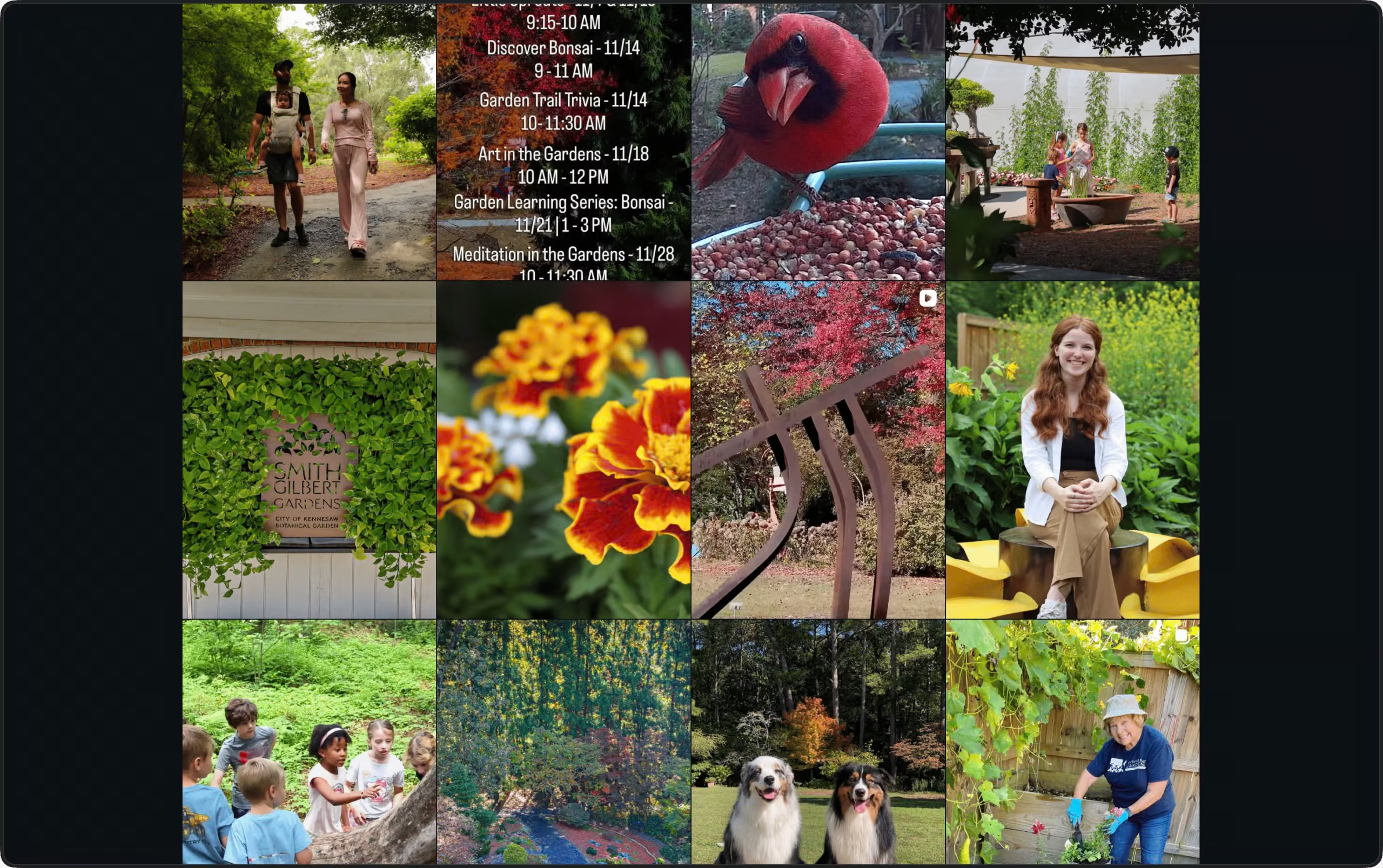
When reviewing Smith-Gilbert Gardens’ online presence we looked closely at how the organization presented itself across its social media profiles. We believe social media is a key avenue in which non-profits engage with their community and represent themselves to potential donors, volunteers and attendees. Across the organization’s social media pages, we noticed that photos lacked a call to action that would engage users. For example, this post was made to advertise an upcoming workshop at the garden covering how to care for your bonsai. While the photo for the post does feature a bonsai tree, it doesn’t feature any details regarding the event in the image or caption besides a brief note in the caption stating, “Coming up this Saturday”.
Photo by @smithgilbertga on Instagram

Why should we grow this way?
As an organization with a mission and goals, the role of social media changes entirely from a public archive to a channel for advertising, outreach and getting your audience invested. This reorientation requires an approach that cuts through the noise of an Instagram or Facebook feed and quickly communicates what is most important for the target audience to understand. We believe the most effective way to execute this is to add information directly within the image through graphics and text that relays key information. This is the key suggestion for this post, while the image is beautiful, the effort required to connect the post with the event it advertises is more than the average user is likely to expend. Ideally the image for a post like this communicates the core invitation, with a title, date and address for the event. Once you establish this information in the image, a likely attendee is more likely to engage with further information in the caption.
What would this look like?
We didn’t want to suggest potential changes to social media posts without creating something to illustrate what our suggestions could look like. When working on our mock social media post we ultimately landed on this iteration of the design:
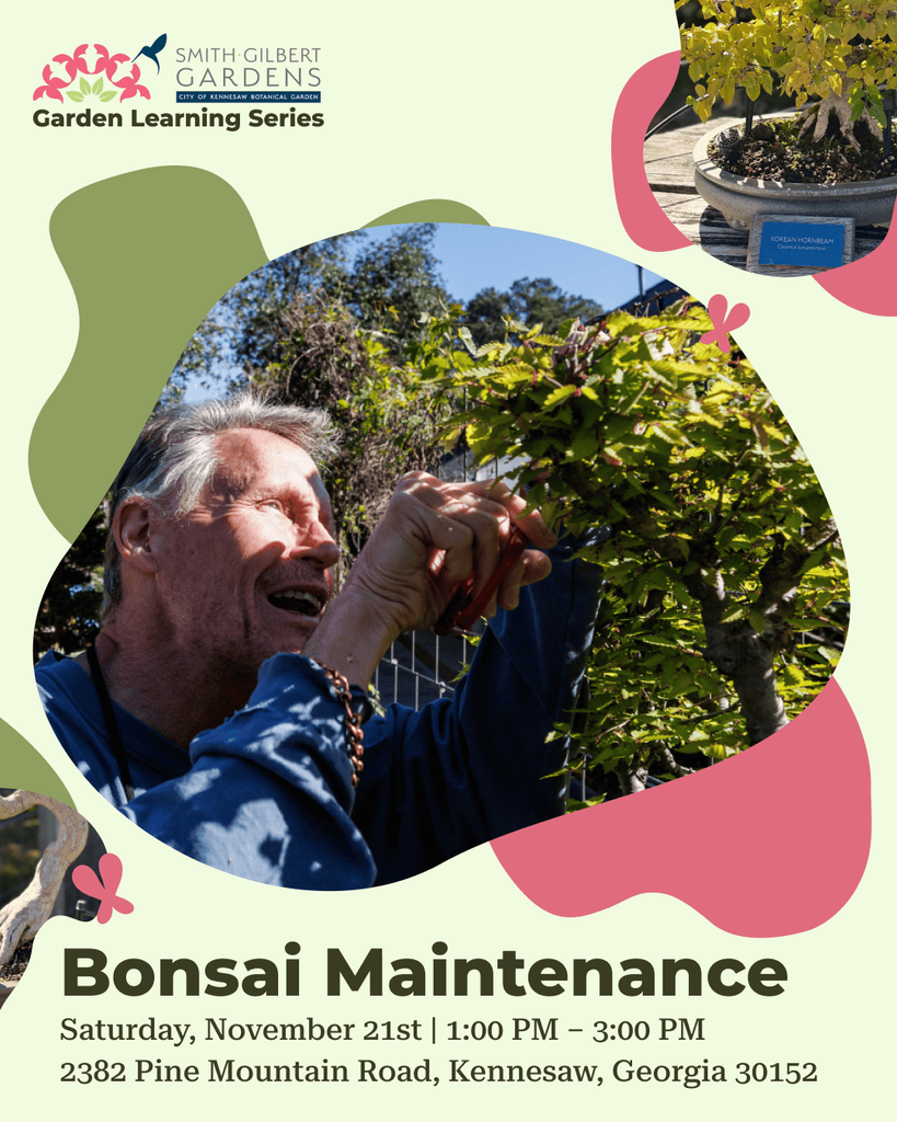
When creating this mockup, we took great care in making sure we made something that fit the established brand identity of Smith-Gilbert Gardens while engaging users.
Some of the design decisions include:
- “Garden Learning Series” placed under the logo suggests to the user that this is not only a one-off event but an ongoing series of events that the organization has put on regularly.
- Organic and leaf-like shapes are featured as graphics throughout and as the shape the featured image and supplemental images are contained in. This adds visual interest while fitting within the brand identity of the organization.
- “Bonsai Maintenance” is placed prominently on the image in bold dark text to quickly establish the content of the event to the user. This is another decision made to draw user attention quickly.
- Date, time, and location are provided underneath the event title. This reduces friction for potential attendees, allowing a quick scan of event details to add to their calendar or invite friends.
- The photos chosen are directly relevant to the topic of the event and show someone engaged in the activity being advertised.
We believe that if posts across Smith-Gilbert Gardens implemented choices similar to this, engagement could increase and social media posts could function as vehicles for further attendance to key events.
What can we learn from others?
When implementing new ideas, finding value in looking at what others in your field are doing and taking note of what might work for you is helpful. A great example we found while researching was the non-profit Earth Hour. Earth Hour provides open source resources for their logos and branding guides. They provide these design templates and logos through their brand resource page, making it easy for not only their own staff to make social media posts but for dedicated volunteers as well. Smith-Gilbert Gardens could leverage something similar to make effective posting easy for staff and volunteers easier as well.
What are the key takeaways?
- Incorporate critical information into images rather than relying on captions. Critical information includes title, date, and time. Doing so more effectively engages the user and communicates the post’s intent.
- Balance ADA compliance with visual engagement, ensuring that users can meaningfully connect with a post while maintaining accessibility for underserved communities.
- Create design resources for social media posts. This could not only be useful for internal use but making it public could allow dedicated volunteers to do high quality brand work for your organization.
One response to “Social Media Analysis”
-
[…] Social Media Community Engagement […]
Leave a Reply